现在最流行的前端布局技术之一是弹性布局(Flexbox)。Flexbox提供了一种简单而强大的方式来创建自适应和灵活的布局。它可以轻松地实现水平和垂直居中、等高列布局、自适应网格等常见布局需求。Flexbox还具有简洁的语法和强大的控制能力,使得布局变得更加直观和易于理解。
另一个流行的布局技术是栅格布局(Grid)。栅格布局提供了更多的灵活性和精确控制的能力,可以实现复杂的网格布局。它可以将页面划分为行和列,通过设置网格单元格的属性,实现各种布局需求。栅格布局在响应式设计中非常有用,可以适应不同屏幕尺寸和设备。
前端布局发展史
前端的布局技术也是一点发展出来的
-
表格布局:在Web技术的早期阶段,网页设计主要采用表格布局技术。通过使用HTML表格元素来创建网页布局,但这种方法存在一些限制,不够灵活,难以适应不同设备和屏幕尺寸。
-
基于表格的布局:随着对表格布局的限制的认识,人们开始使用基于表格的布局技术,如使用div和表格属性来创建网页布局。这种方法可以更好地控制布局,但仍然存在一些局限性。
- 优点:简单易用,适用于简单的网页布局。
- 缺点:不够灵活,难以适应不同设备和屏幕尺寸,不推荐用于复杂的布局。
-
浮动布局:随着CSS技术的发展,浮动布局成为一种流行的前端布局技术。通过将元素浮动到左侧或右侧,其他元素可以环绕在其周围。这种方法可以实现多列布局,但对于复杂的布局可能会出现问题。
- 优点:相对于纯表格布局更灵活,可以更好地控制布局。
- 缺点:仍然受到表格布局的限制,不适用于响应式布局。
-
定位布局:定位布局是一种通过使用CSS中的定位属性(如position)来放置元素的布局技术。通过设置元素的位置和偏移量,可以将元素放置在页面的任何位置。这种方法对于创建特定位置的元素非常有用,但不适用于自适应布局。
- 优点:可以实现多列布局,适用于简单的布局需求。
- 缺点:对于复杂的布局可能会出现问题,需要处理清除浮动等附加样式。
-
弹性布局:弹性布局(Flexbox)是CSS3中引入的一种布局技术。它通过使用弹性容器和弹性项目来实现自适应和灵活的布局。弹性布局可以在不同屏幕尺寸和设备上自动调整元素的大小和位置,使得响应式布局更加容易实现。
- 优点:自适应性强,可以在不同屏幕尺寸和设备上自动调整元素的大小和位置。
- 缺点:对于复杂的布局可能需要更多的CSS样式和媒体查询。
-
栅格布局:栅格布局(Grid)是CSS3中另一种强大的布局技术。它通过将网格划分为行和列,可以更精确地控制元素的位置和大小。栅格布局提供了更多的布局选项和灵活性,使得复杂的网页布局更加容易实现。
- 优点:提供了更多的布局选项和灵活性,可以更精确地控制元素的位置和大小。
- 缺点:对于较旧的浏览器支持可能不完整,需要使用浏览器前缀或后备方案。
除了以上提到的布局技术,还有一些流行的框架和库,如Bootstrap、Foundation和Tailwind CSS等,它们提供了预定义的布局组件和样式,使得前端布局更加简单和快速。
注意 浮动布局 根本就不是一种布局手段,千万不要用。那玩意是用来做文字环绕的,根本不是为了布局而生的。
Flex 布局学习笔记
自己写了一个小demo ,用来 观察 在 flex 布局下 不同属性的效果,进而加深对 flex 布局的理解
vue 单页面应用
<template>
<el-card id="card0" header="默认布局">
<div class="flexBox">
<el-card class="item item1" header="item1 { width: 600px;}"></el-card>
<el-card class="item item2" header="item2 { width: 300px;}"></el-card>
<el-card class="item item3" header="item3 { width: 300px;}"></el-card>
<el-card class="item item4" header="item4 { width: 300px;}"></el-card>
<el-card class="item item5" header="item5 { width: 300px;}"></el-card>
</div>
</el-card>
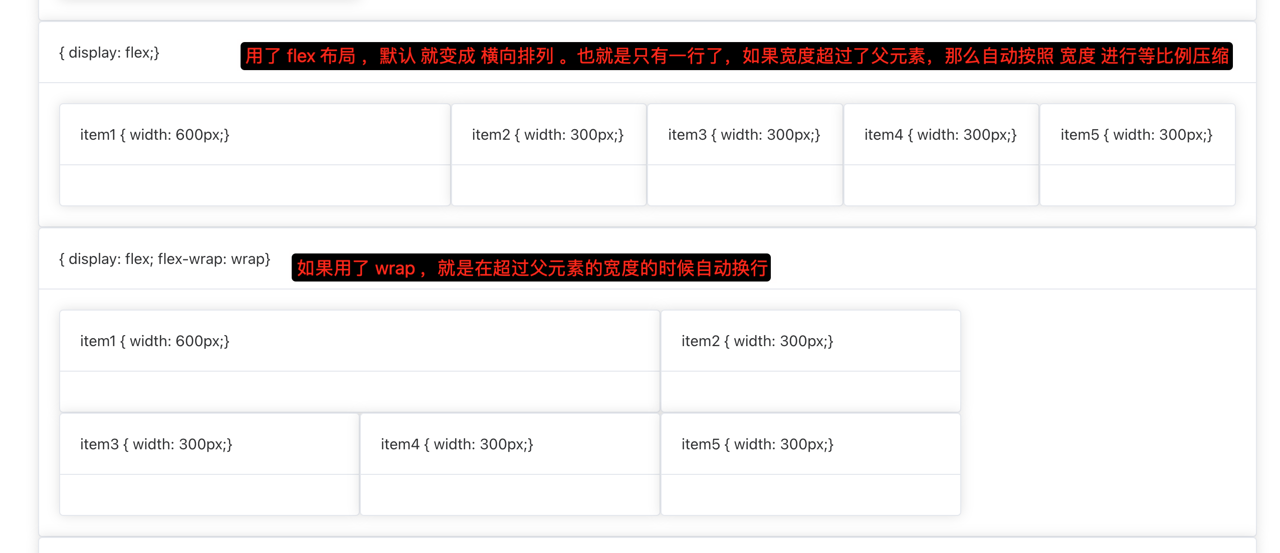
<el-card id="card1" header="{ display: flex;}">
<div class="flexBox">
<el-card class="item item1" header="item1 { width: 600px;}"></el-card>
<el-card class="item item2" header="item2 { width: 300px;}"></el-card>
<el-card class="item item3" header="item3 { width: 300px;}"></el-card>
<el-card class="item item4" header="item4 { width: 300px;}"></el-card>
<el-card class="item item5" header="item5 { width: 300px;}"></el-card>
</div>
</el-card>
<el-card id="card2" header="{ display: flex; flex-wrap: wrap}">
<div class="flexBox">
<el-card class="item item1" header="item1 { width: 600px;}"></el-card>
<el-card class="item item2" header="item2 { width: 300px;}"></el-card>
<el-card class="item item3" header="item3 { width: 300px;}"></el-card>
<el-card class="item item4" header="item4 { width: 300px;}"></el-card>
<el-card class="item item5" header="item5 { width: 300px;}"></el-card>
</div>
</el-card>
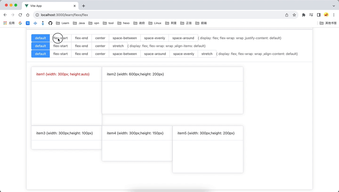
<el-card id="card4">
<template #header>
<el-radio-group v-model="justify">
<el-radio-button label="default"></el-radio-button>
<el-radio-button label="flex-start"></el-radio-button>
<el-radio-button label="flex-end"></el-radio-button>
<el-radio-button label="center"></el-radio-button>
<el-radio-button label="space-between"></el-radio-button>
<el-radio-button label="space-evenly"></el-radio-button>
<el-radio-button label="space-around"></el-radio-button>
<el-text> { display: flex; flex-wrap: wrap ;justify-content: {{ justify }}}</el-text>
</el-radio-group>
<el-radio-group v-model="alignItem">
<el-radio-button label="default"></el-radio-button>
<el-radio-button label="flex-start"></el-radio-button>
<el-radio-button label="flex-end"></el-radio-button>
<el-radio-button label="center"></el-radio-button>
<el-radio-button label="stretch"></el-radio-button>
<el-text> { display: flex; flex-wrap: wrap ;align-items: {{ alignItem }}}</el-text>
</el-radio-group>
<el-radio-group v-model="alignContent">
<el-radio-button label="default"></el-radio-button>
<el-radio-button label="flex-start"></el-radio-button>
<el-radio-button label="flex-end"></el-radio-button>
<el-radio-button label="center"></el-radio-button>
<el-radio-button label="space-between"></el-radio-button>
<el-radio-button label="space-around"></el-radio-button>
<el-radio-button label="space-evenly"></el-radio-button>
<el-radio-button label="stretch"></el-radio-button>
<el-text> { display: flex; flex-wrap: wrap ;align-content: {{ alignContent }}}</el-text>
</el-radio-group>
</template>
<div :class="{ between: justify==='space-between',evenly: justify==='space-evenly',around:justify==='space-around',
justify_content_start: justify==='flex-start',justify_content_end: justify==='flex-end',justify_content_center: justify==='center',
start:alignItem==='flex-start',end:alignItem==='flex-end',center:alignItem==='center',stretch:alignItem==='stretch',
content_start:alignContent==='flex-start',content_end:alignContent==='flex-end',content_center:alignContent==='center',content_stretch:alignContent==='stretch',
space_between:alignContent==='space-between',space_around:alignContent==='space-around',space_evenly:alignContent==='space-evenly'
}"
class="flexBox">
<el-card class="item item1" header="item1 {width: 300px; height:auto}" style="color: red"></el-card>
<el-card class="item item2" header="item2 {width: 600px;height: 200px}"></el-card>
<el-card class="item item3" header="item3 {width: 300px;height: 100px}"></el-card>
<el-card class="item item4" header="item4 {width: 300px;height: 150px}"></el-card>
<el-card class="item item5" header="item5 {width: 300px;height: 200px}"></el-card>
</div>
</el-card>
</template>
<script setup>
import {ref} from "vue";
const justify = ref("default");
const alignItem = ref("default");
const alignContent = ref("default");
</script>
<style scoped>
#card0 .item {width: 300px;}
#card0 .item1 {width: 600px;}
#card1 .flexBox {display: flex;}
#card1 .item {width: 300px;}
#card1 .item1 {width: 600px;}
#card2 .flexBox {display: flex;flex-wrap: wrap}
#card2 .item {width: 300px;}
#card2 .item1 {width: 600px;}
#card4 .item1 {width: 300px;}
#card4 .item2 {width: 600px;height: 200px}
#card4 .item3 {width: 300px;height: 100px}
#card4 .item4 {width: 300px;height: 150px}
#card4 .item5 {width: 300px;height: 200px}
#card4 .flexBox { display: flex;flex-wrap: wrap; height:500px;}
#card4 .justify_content_start {justify-content: flex-start}
#card4 .justify_content_end{justify-content: flex-end;}
#card4 .justify_content_center {justify-content: center}
#card4 .between {justify-content: space-between}
#card4 .around {justify-content: space-around;}
#card4 .evenly {justify-content: space-evenly}
#card4 .start {align-items: flex-start}
#card4 .end {align-items: flex-end}
#card4 .center {align-items: center}
#card4 .stretch {align-items: stretch}
#card4 .content_start {align-content: flex-start}
#card4 .content_end {align-content: flex-end}
#card4 .content_center {align-content: center}
#card4 .content_stretch {align-content: stretch}
#card4 .space_between {align-content: space-between}
#card4 .space_around {align-content: space-around }
#card4 .space_evenly {align-content: space-evenly }
</style>